Some belated pics from a while back. My scans are getting some unpleasant artifacts from the page below; The most immediate solution is scanning with white paper behind the page, but the likelier solution is that I need to go back to sketchbooks with thicker paper stock.
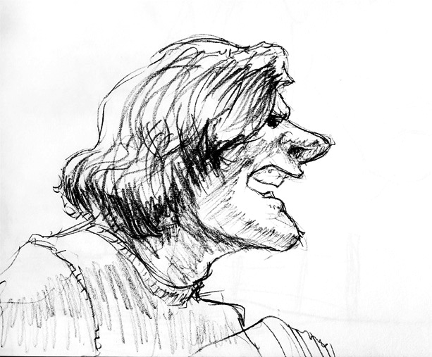
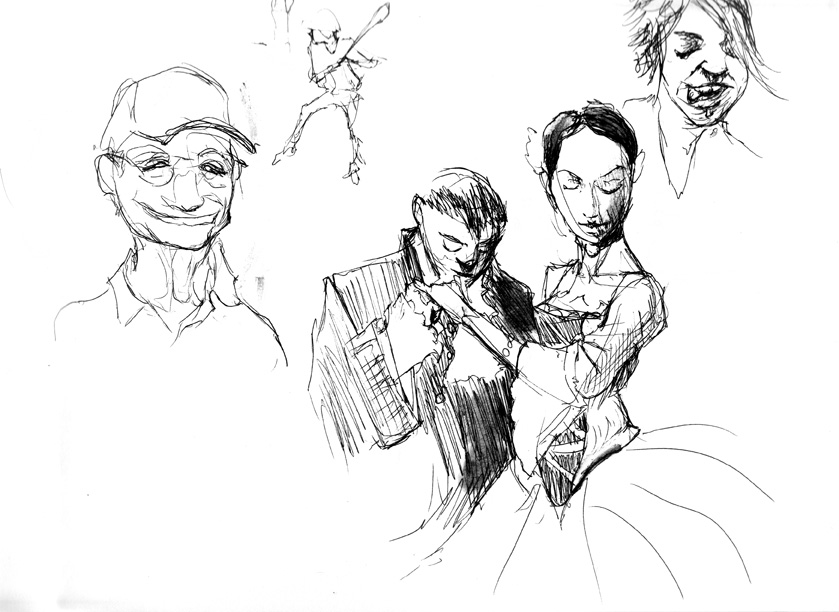
sketch
In my spare time I’ve been messing around with oil painting recently, and one time-honored technique is that of the cartoon. Although its modern meaning points to animation, the term originates from the technique of inking a drawing as an initial paint layer. Since you paint oils in transparent layers that become increasingly opaque, this lets you put down initial layers, and once it’s dry you can still grasp the concept of the inked drawing through the earlier transparent layer, until finally it disappears.

Here’s a self portrait I recently started. Among things I ought to have done with this initial layer include painting a monochrome grisaille rather than working in a variety of color (and arguably too much detail), but since I was painting on top of failed previous attempt I dove ahead, just to have fun and not waste a practice board.
Because I still use drawing techniques as a crutch, I wanted to try methods of cartoon with a pen instead of a brush. I’m curious to see if it has negative results in the longevity of the painting. And if it’s eventually covered with opaque paint, is it possible nobody will notice? Are certain pens less damaging? Are some usable on canvass, some on boards? MANY earlier things I’ve tried failed to take to the art board’s slick surface. Indeed, it’s possible this pen only did so because it was painted on the failed oils of an older project.

After a day of drying, since I was painting on a flat board (thus meaning brush strokes occasionally scraped through unpleasantly) I went in and blended certain edges, and buffed out some brush artifacts. I couldn’t do this the day before, but after a day of drying the paint was sticky and tacky, allowing for a finger to blend adequately. Had I done this the day before, a finger would have mopped paint away far too much, showing the failed painting beneath. But another side effect I noticed was worthy of note: As the paint dried, it became more transparent. Perhaps this means initial layers can be painted more opaquely without fear of losing your structural data. The day before this photo was taken, the cartoon was significantly less visible.
Final note: although I draw almost every day, I usually wait til half a sketchbook, then upload the good stuff. However, I often take crappy phone pictures and upload them to Facebook. Isn’t this the place for daily progress? Hence, I plan to upload many more daily crappy blog posts. (And I can still sort the future good stuff into the Sketches section of this wordpress, eh?)
First off : Seabug is Saturday! So come hang out and talk Blender with Blender people.
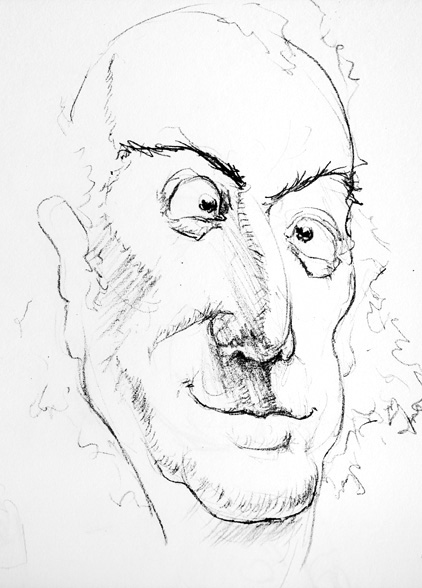
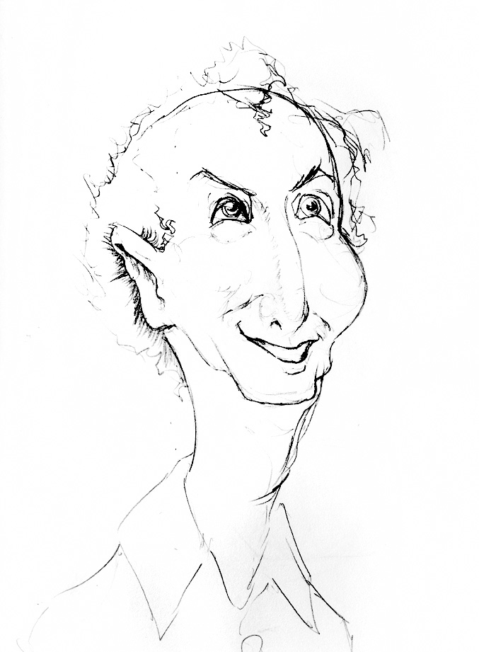
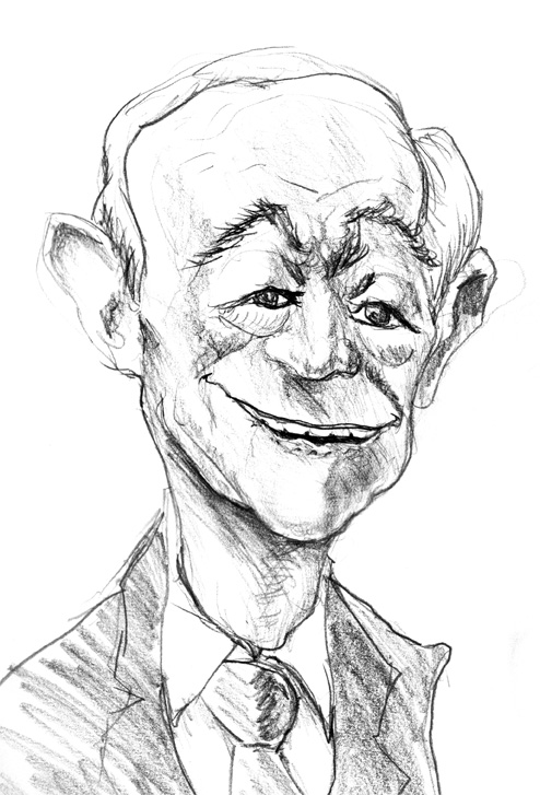
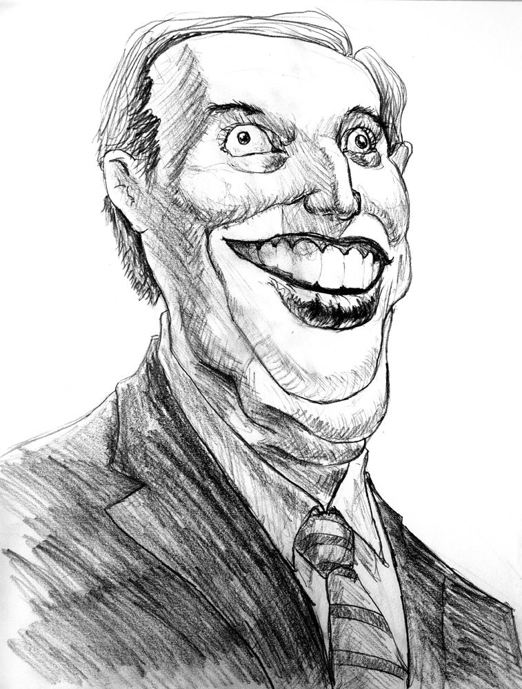
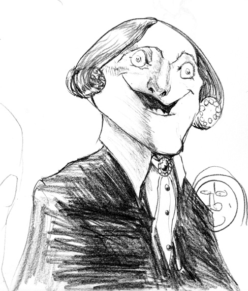
Been caricaturing more. It’s hard to nail down a formula. There’s a clear difference between drawing a funny anonymous face, and drawing a funny face that looks more like Tony Danza than a Tony Danza photograph. Been trying to formalize a process, and at the very least here’s the ideas I’ve got so far.
- Draw their biggest or smallest thing first, and make it extra big/small. Big nose? Draw a big nose first. Small, spaced apart eyes? Draw those lil beads first.
- Emphasize asymmetry. This happens more in the lipline (and thus its connected nasolabial furrow and nostrils) and brow (and thus connected left/right eyelid; you usually don’t move one without the other)
- DO NOT start with a principle shape; DO start with separate shapes. The majority of formal construction tutelage suggests that you start a head with an extended sphere or cube; heads done this way, IMHO, instantly lose the ability to show different areas as more or less important Instead of starting with a single spherical skull-and-jaw, build out of lego blocks your jaw (big or small?), your cheekbones (wide or sunk, high or sad?), your nose (Tinkerbell or Jafar?) your teeth block, the thin or thick lips around them, etc…Even your forehead plate, which is just the front part of your skull, can be given a person’s unique shape if you consider it a separate part.
- Consolidate tons of reference photos, OR use one iconic photo. We can all make a momentary face that looks fun, but when taken as part of a series in no way represents our true personality. If you use such a photo as a primary reference, it’ll throw people off, because it’s not a look that actually gets associated with you. Be careful not to overdo a feature that we won’t connect with! That said, some ideas are so iconic, they do deserve to be written in stone. Consider Jack Nicholson’s “Here’s Johnny” face, Stephen Colbert’s eyebrow raise, or the Olsen Twins’ don’t-show-your-teeth smile. These are ingrained into them deeply enough that it’s worth a single photo moment dominating your impression of them.
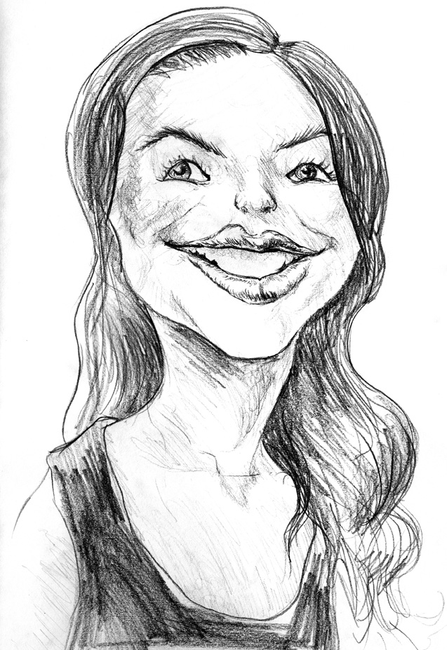
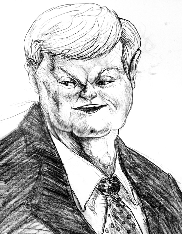
Anyway, blah blah blah, talky art crap.
Here’s my Krita talk from LinuxFest Northwest. Enjoy!
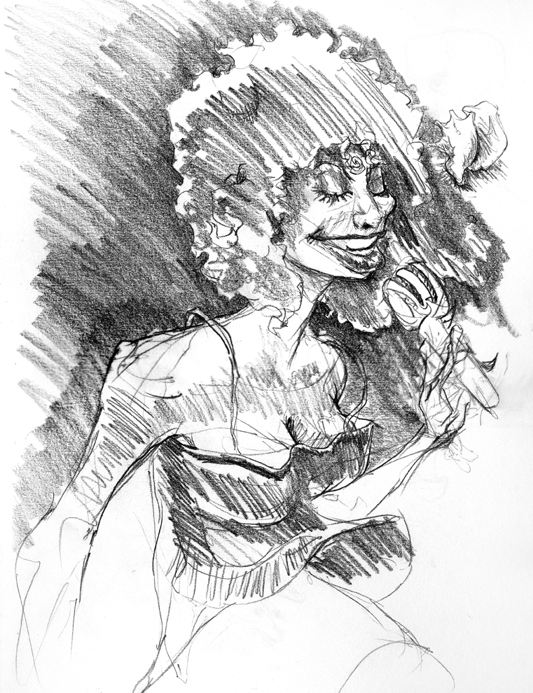
Chaka Khan…plus a conch shell.
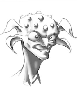
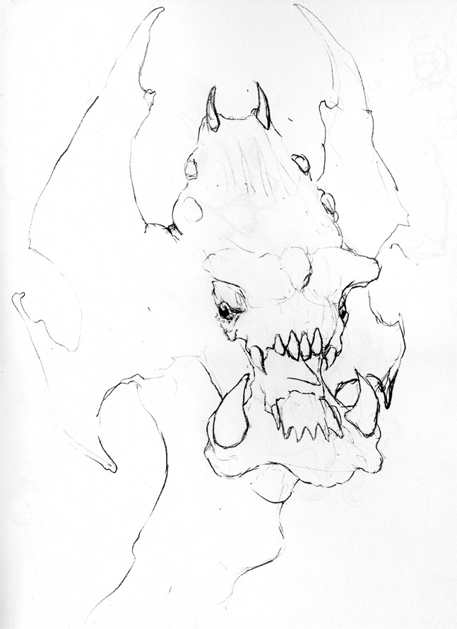
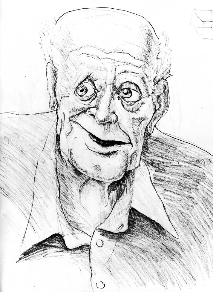
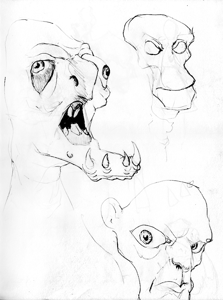
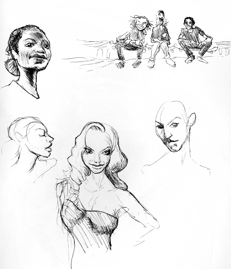
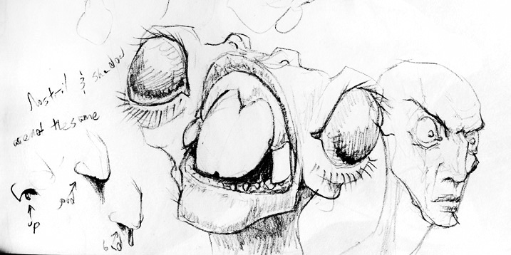
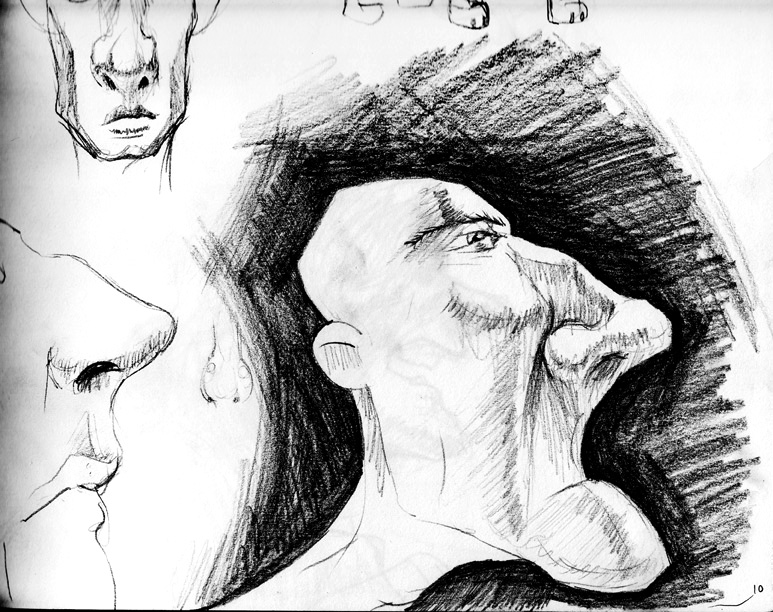
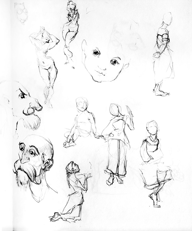
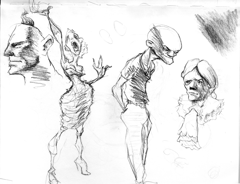
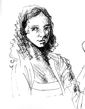
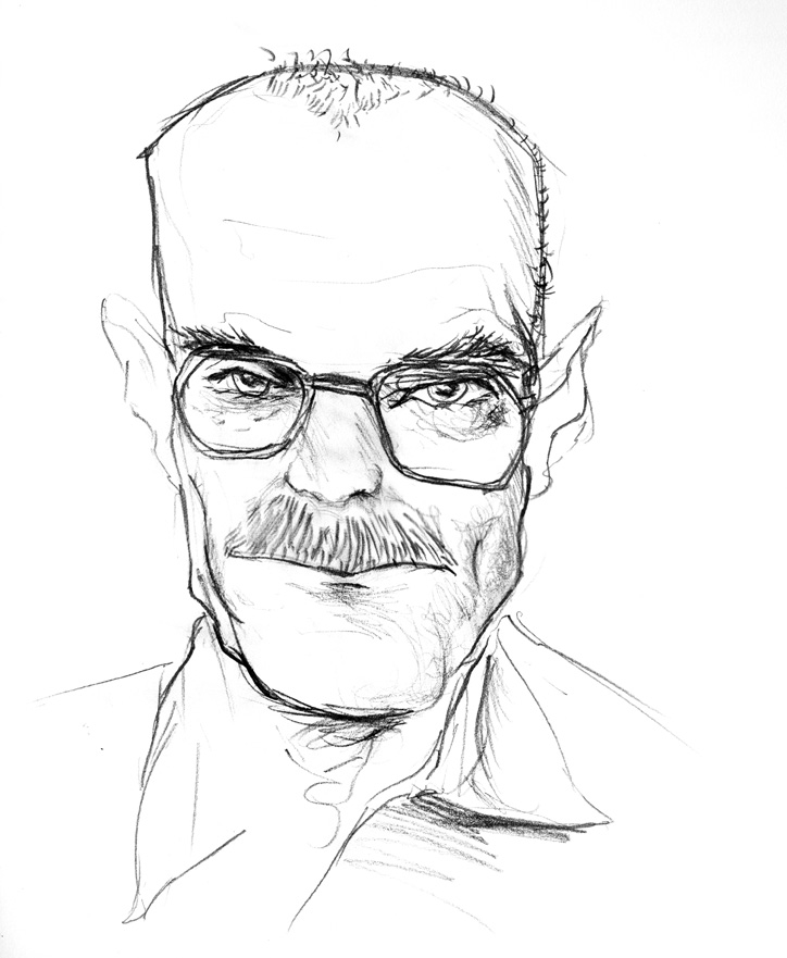
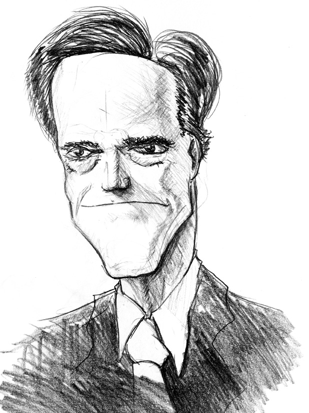
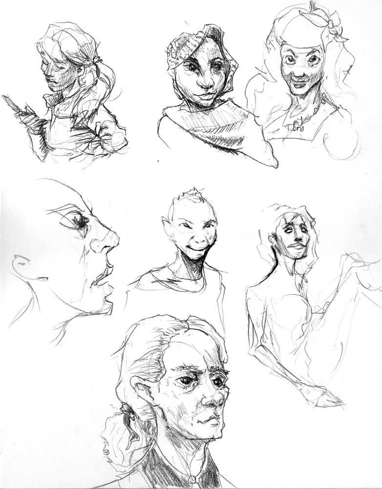
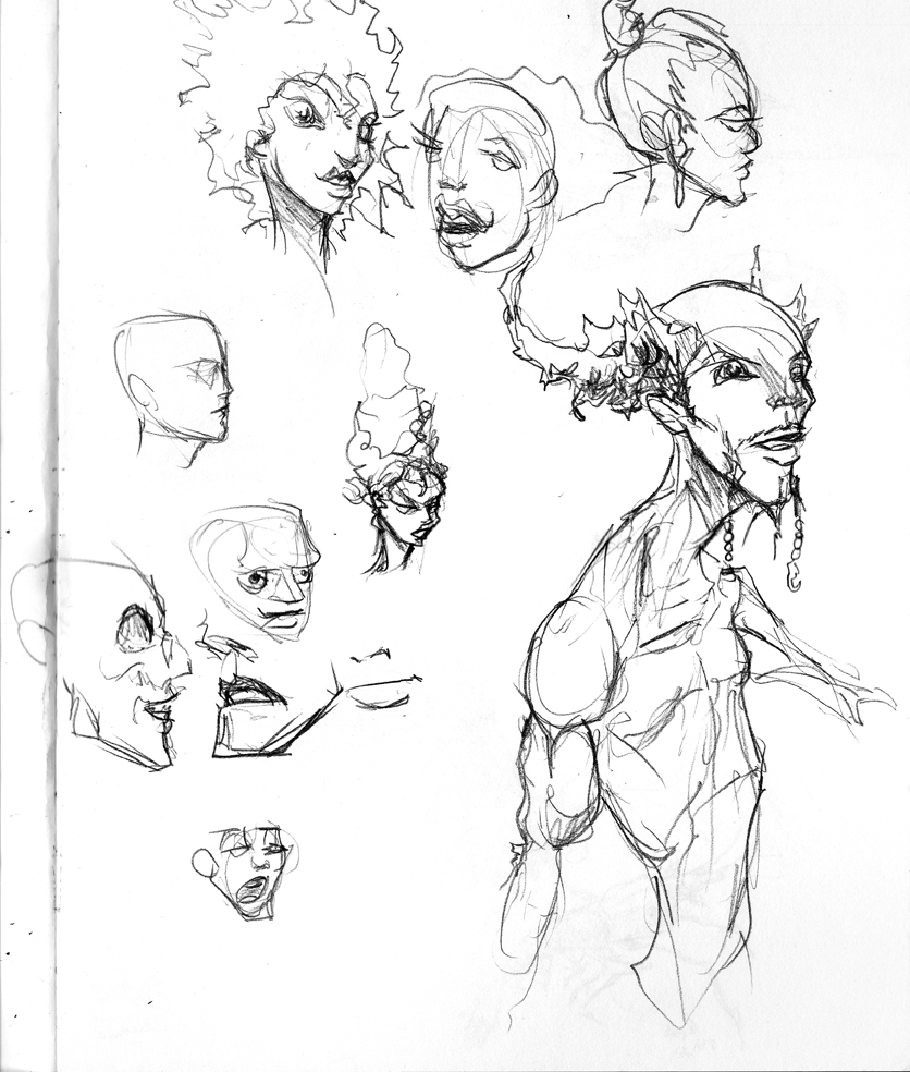
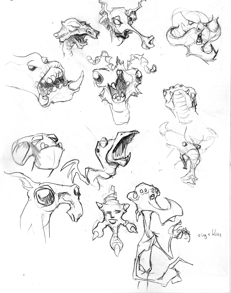
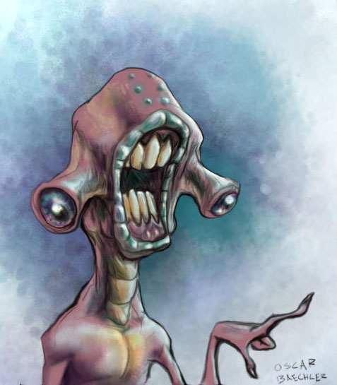
heads
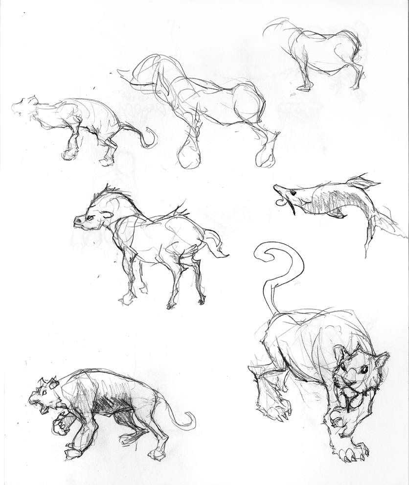
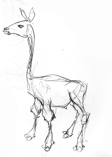
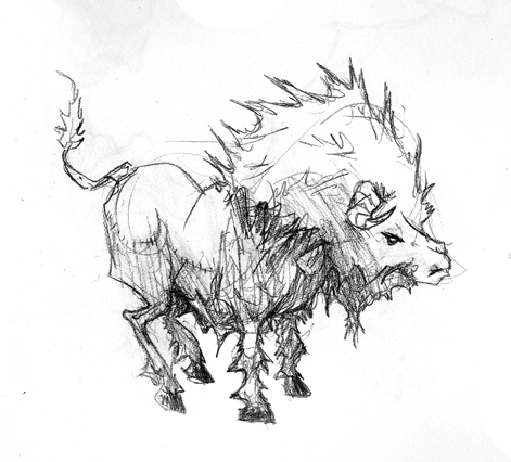
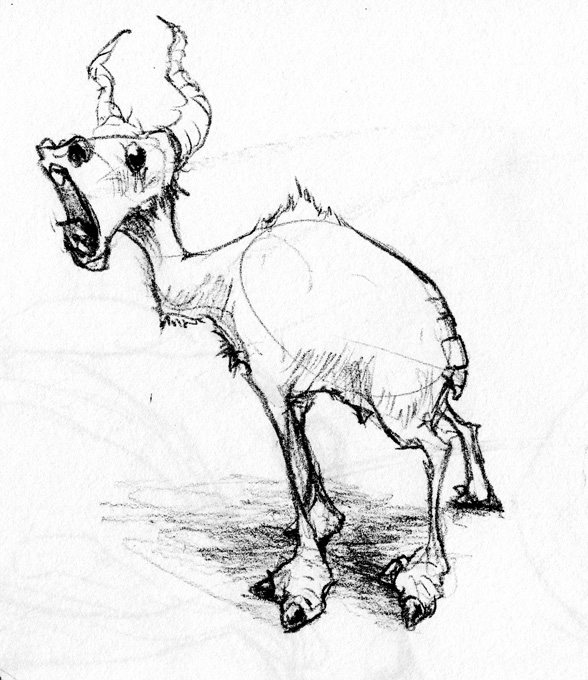
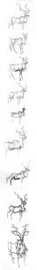
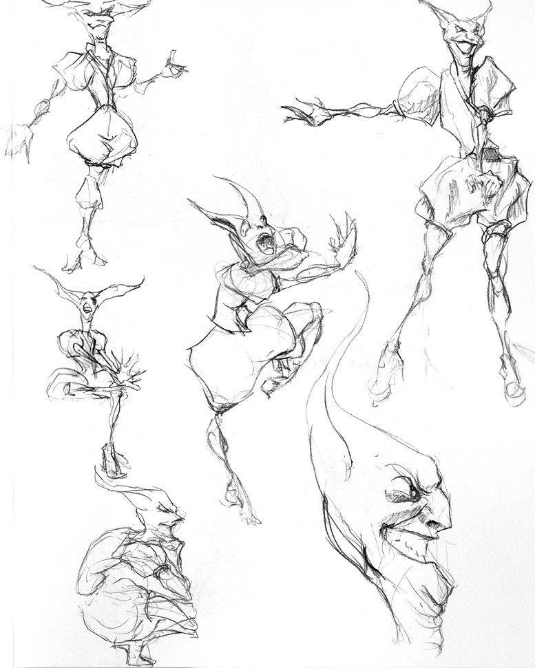
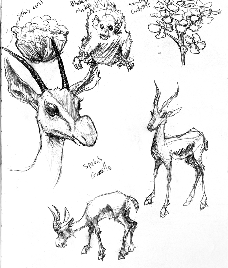
In a talk with the wizardly Tony Mullen at the December Seabug, he quipped that all drawing teachers ever say is “draw looser.” I was drawing this rather nobbly antelope off of arkive.org and felt pretty stiff. So I kept drawing until it felt loose enough. Indeed, I’d say the second-to-last one ended up the best.
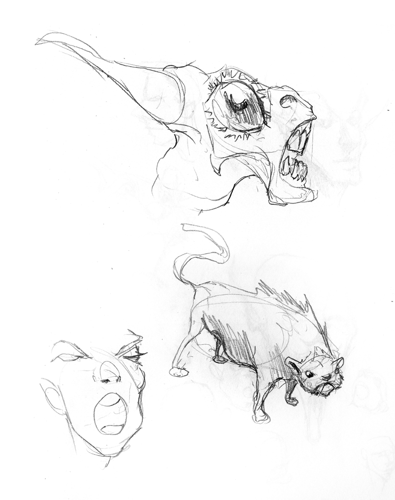
My cat Charlie.
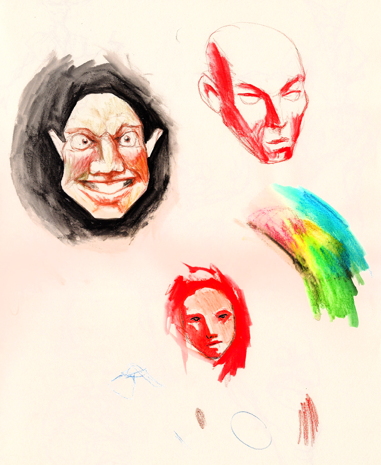
I’ve been playing with watercolor pencils on occasion.
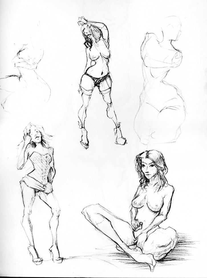
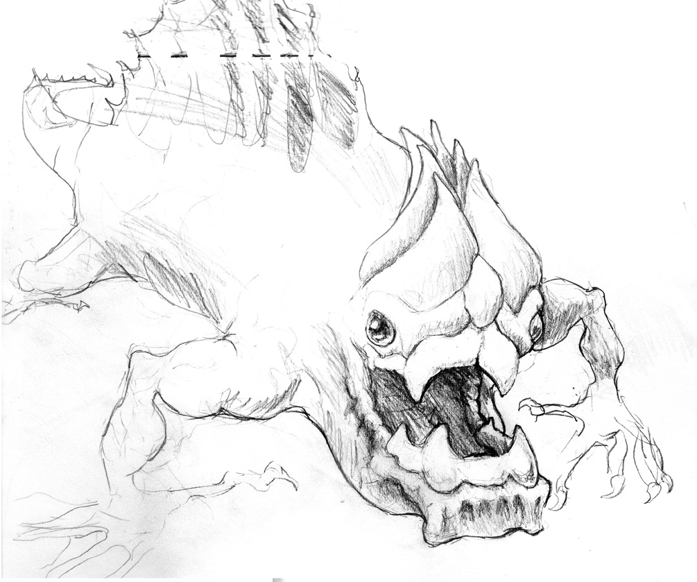
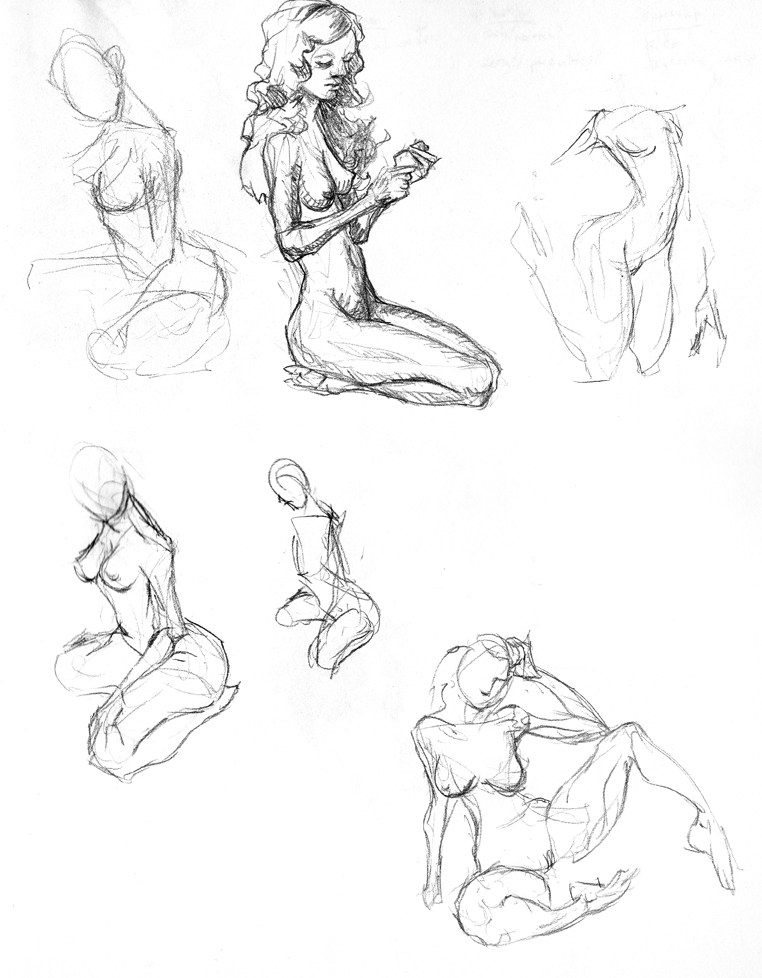
Nekkidness.
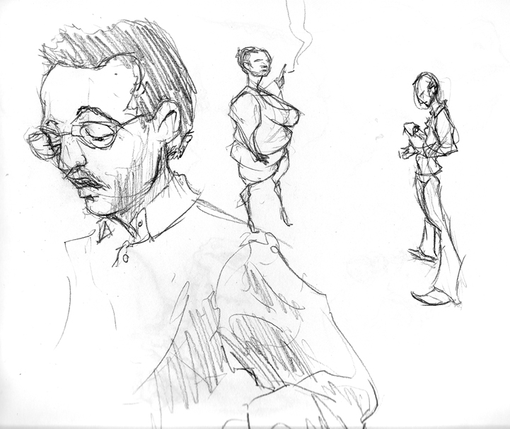
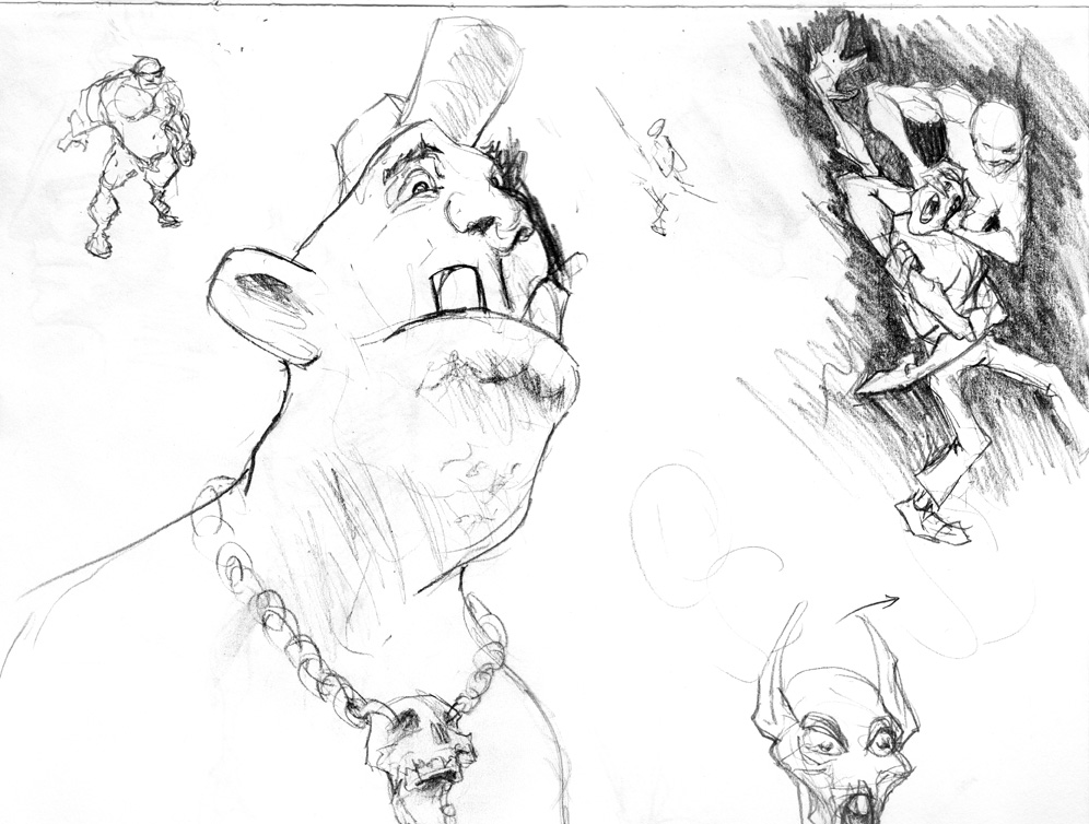
Drew a guy, then tried to stay on the single subject.
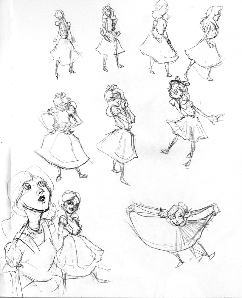
Character studies from Disney’s Alice in Wonderland
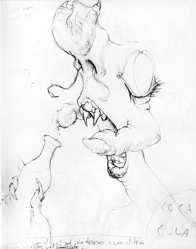
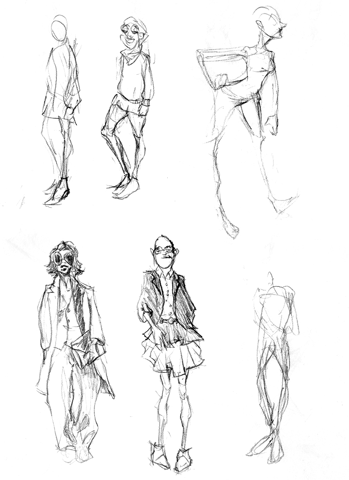
I looked around on the internet for a fashion generator, with humorous results. Pity I can’t recall the URL.
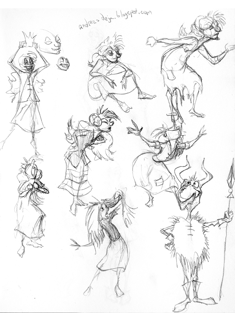
More Disney studies, from the excellent http://andreasdeja.blogspot.com/
Hope you’re all having a wonderful holiday season this year! Here’s my Christmas card, which warped into more of a comic strip than a card.
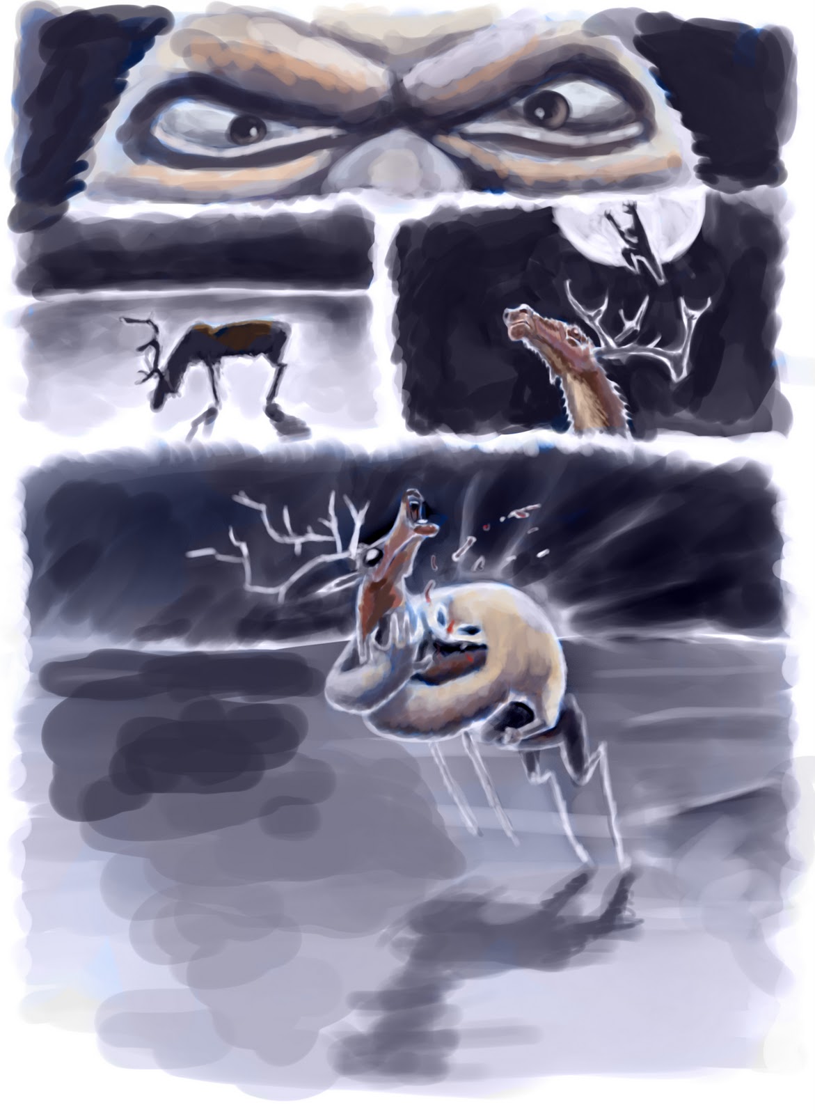
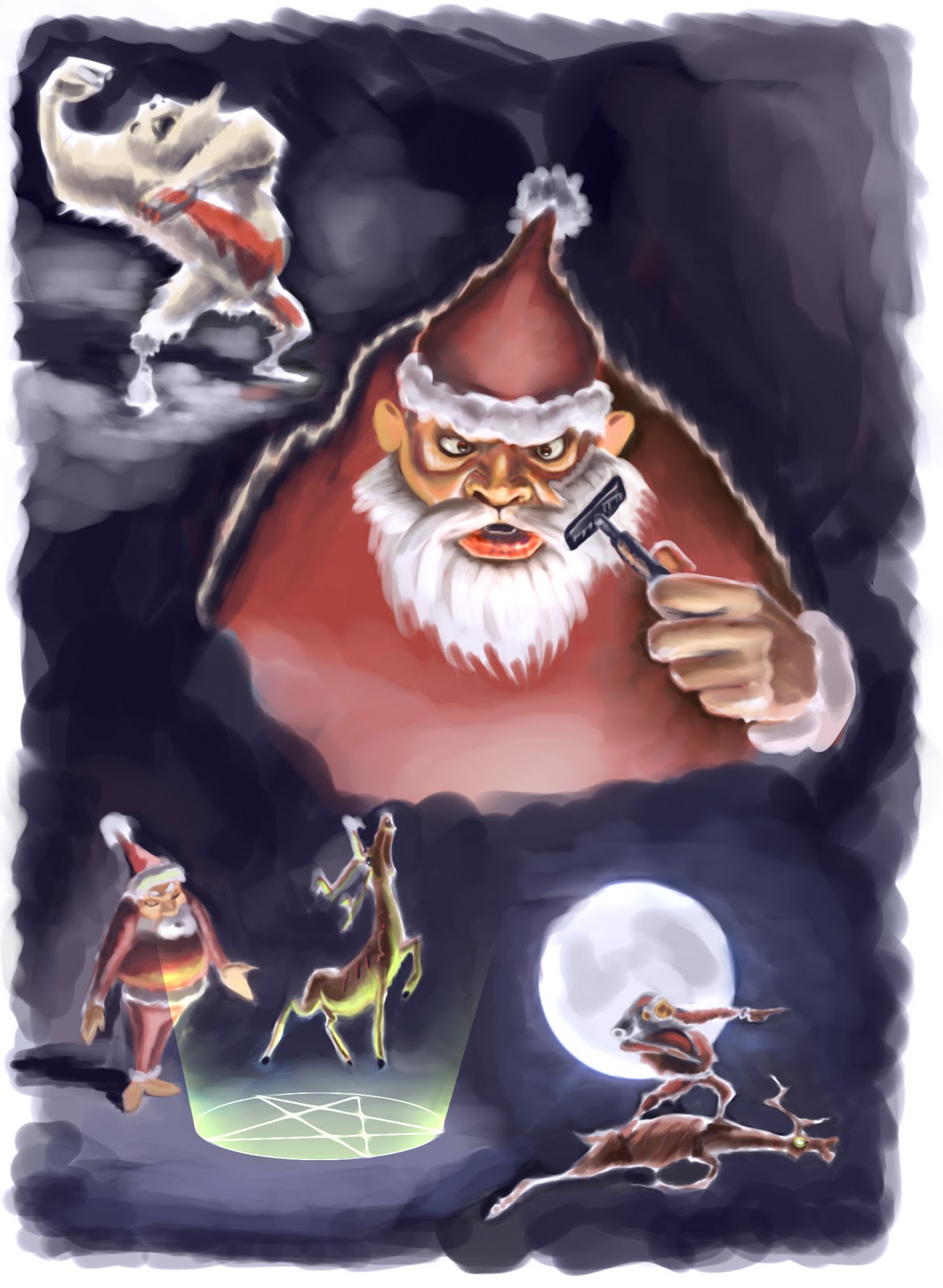

Merry Christmas and a Happy New Year!
Yaaay! Finished this sketchbook in under 2 months, without resorting to unpolished unscannable gesture-binging.
Some credit for this completion deadline goes to Star Trek. I successfully watched Star Trek TNG in entirety over the last month or so, and I don’t think I’ve ever had a show so good for multitask drawing.
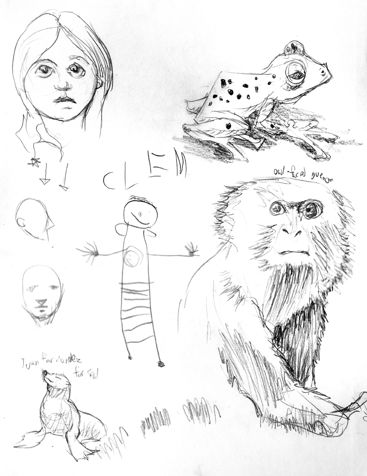
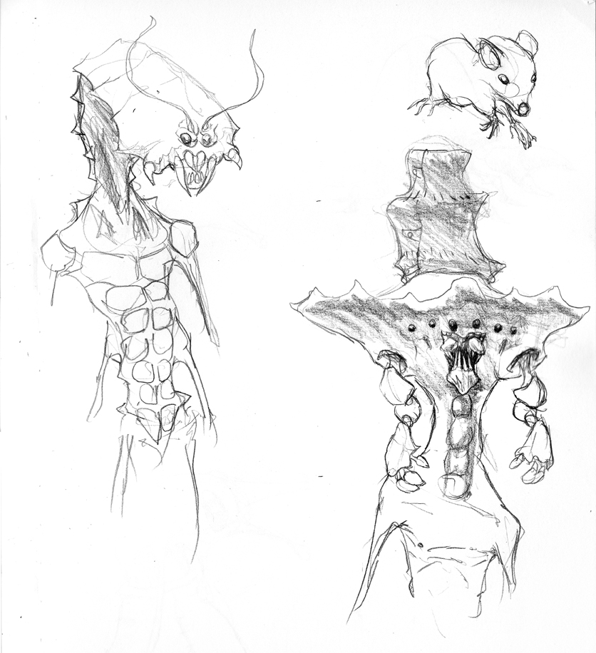
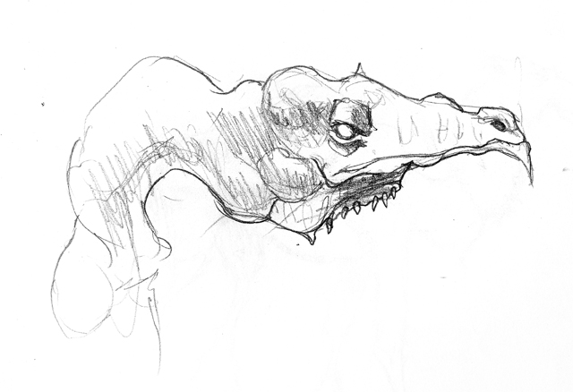
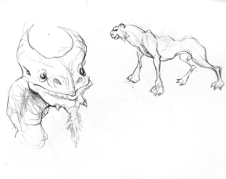
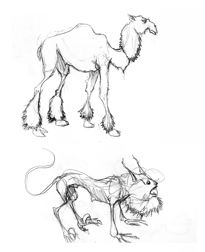
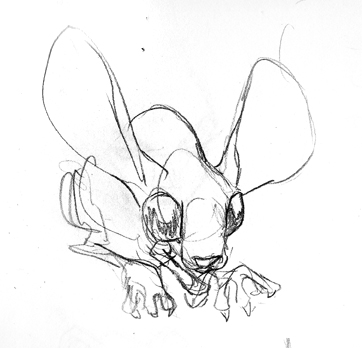
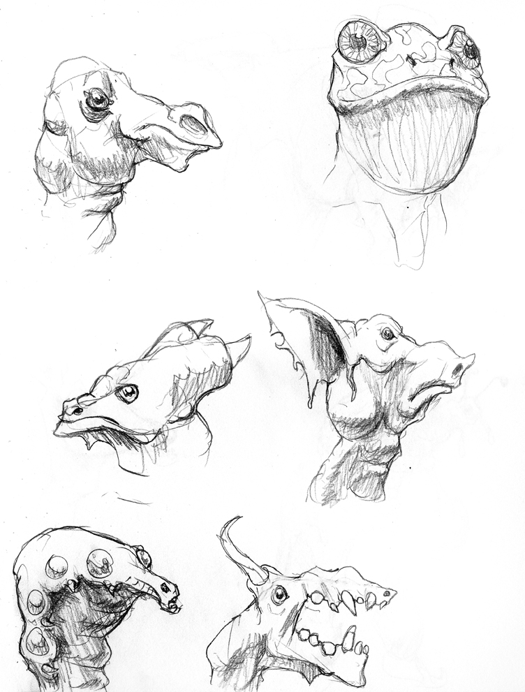
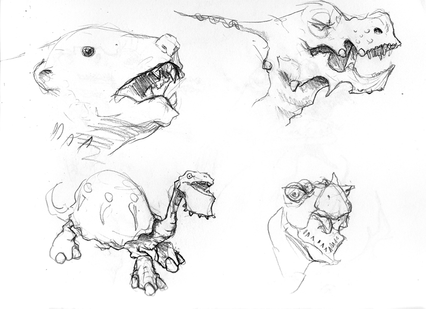
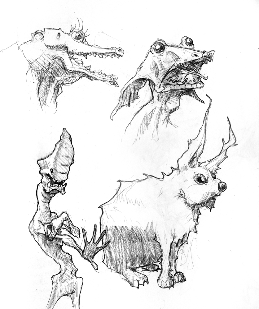
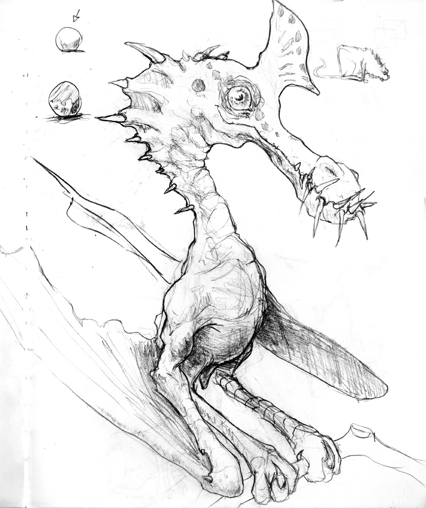
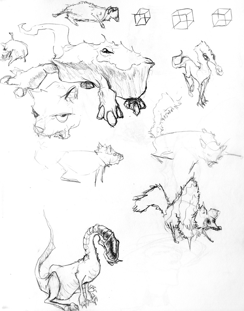
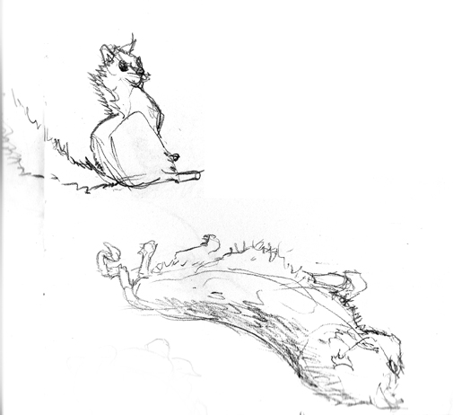
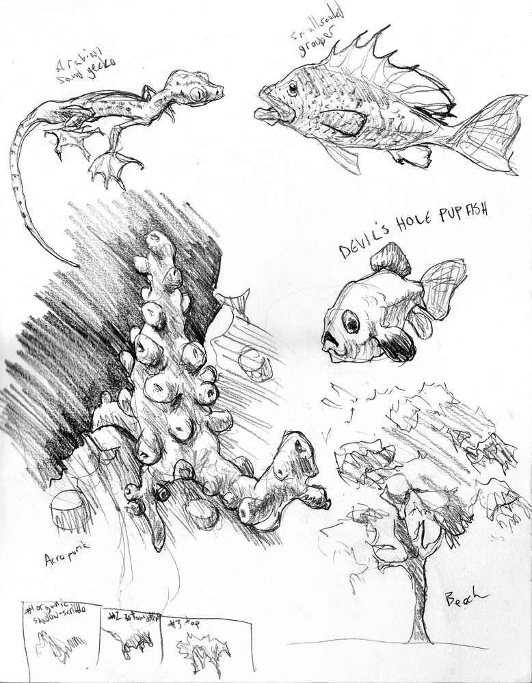
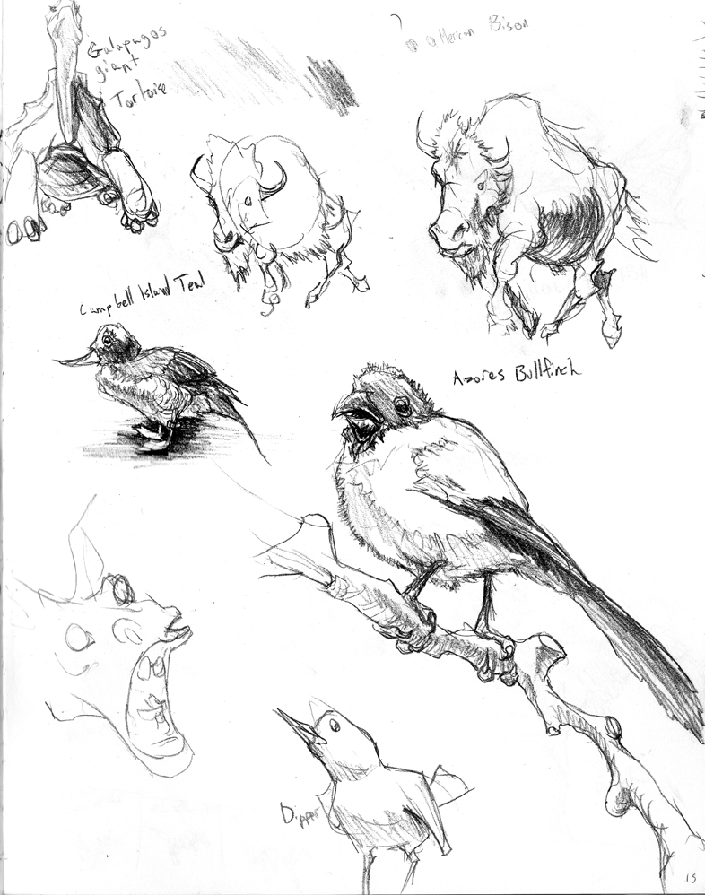
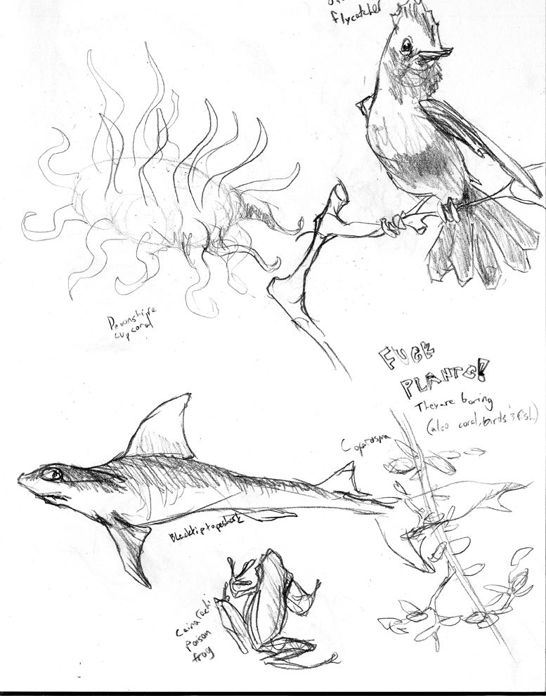
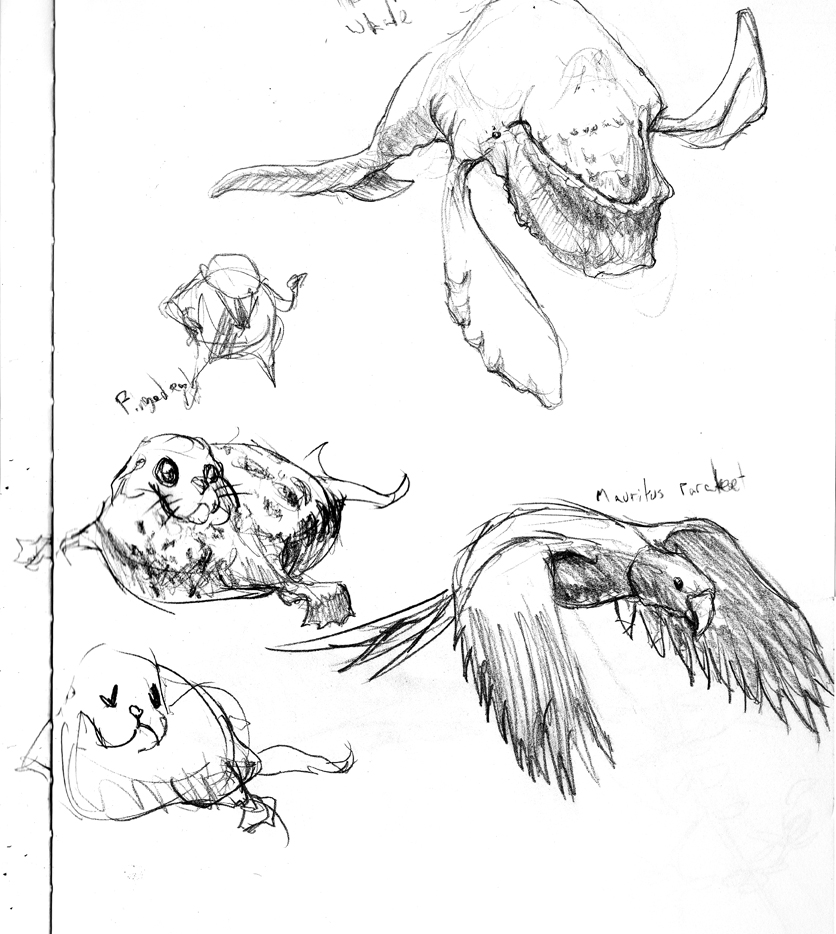
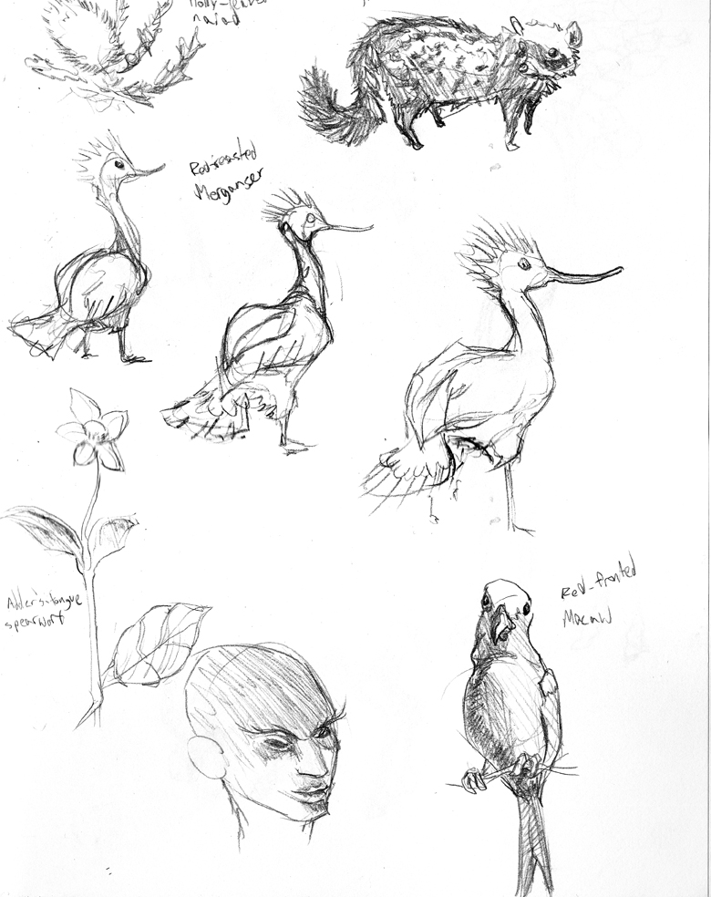
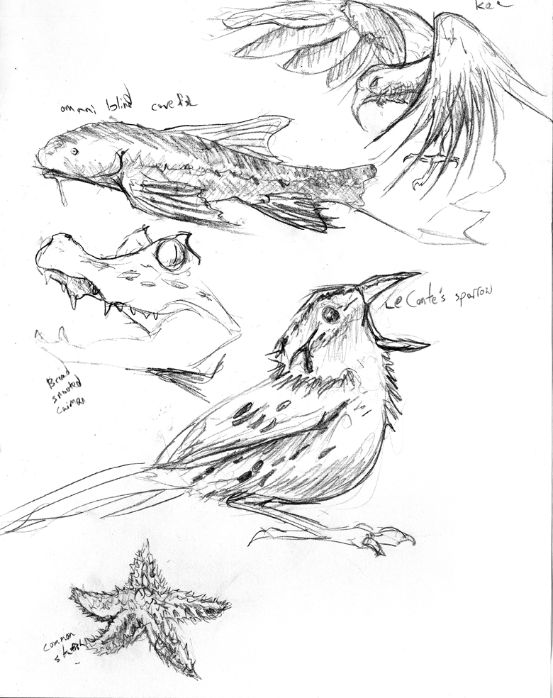
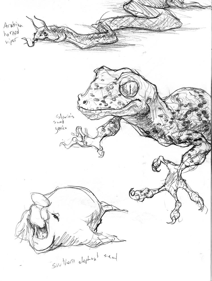
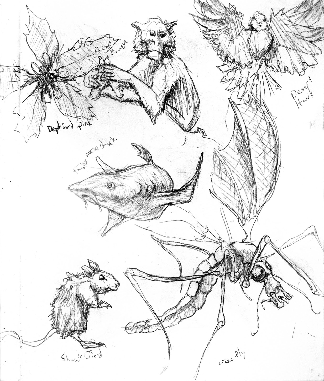
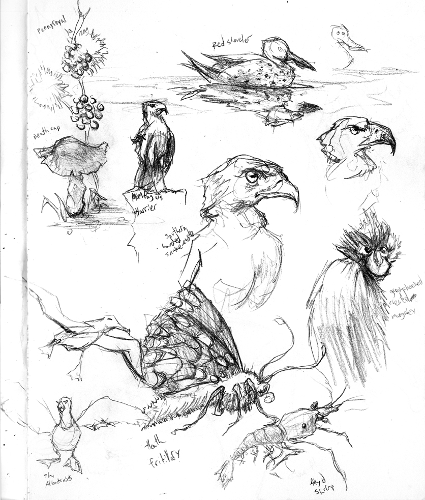
Sketched a lot of lifeforms from photos this time around. I was going to http://www.arkive.org/random-species over and over again. Although I grumbled about it, I tried to draw the plants, coral reefs, fish and birds it threw at me over and over. In other words, the boring stuff. In retrospect, birds, fish and fish are more interesting than I thought. But mostly, plants are stupid.
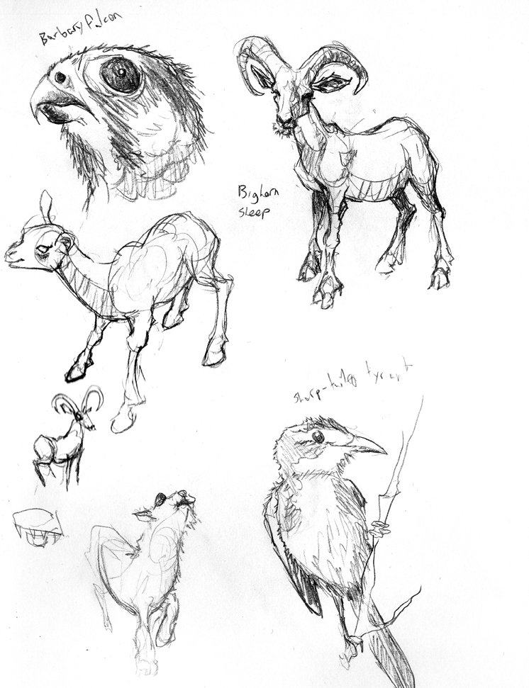
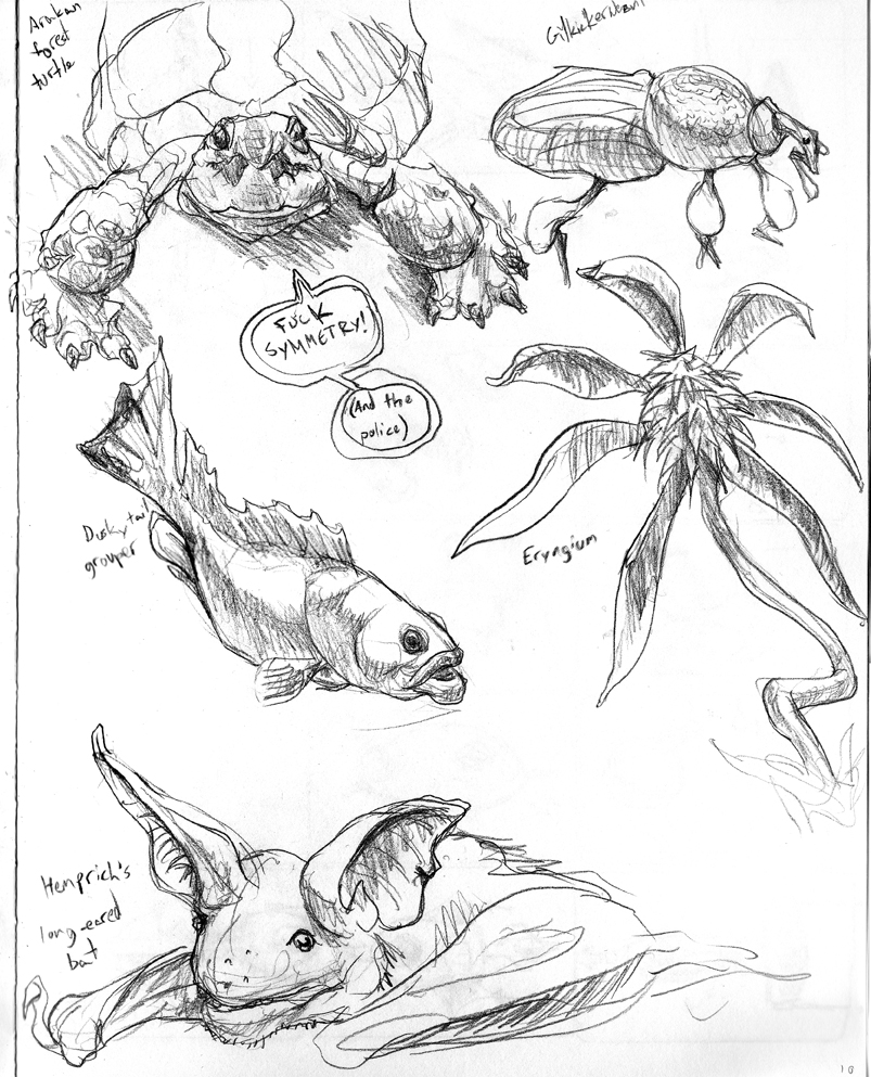
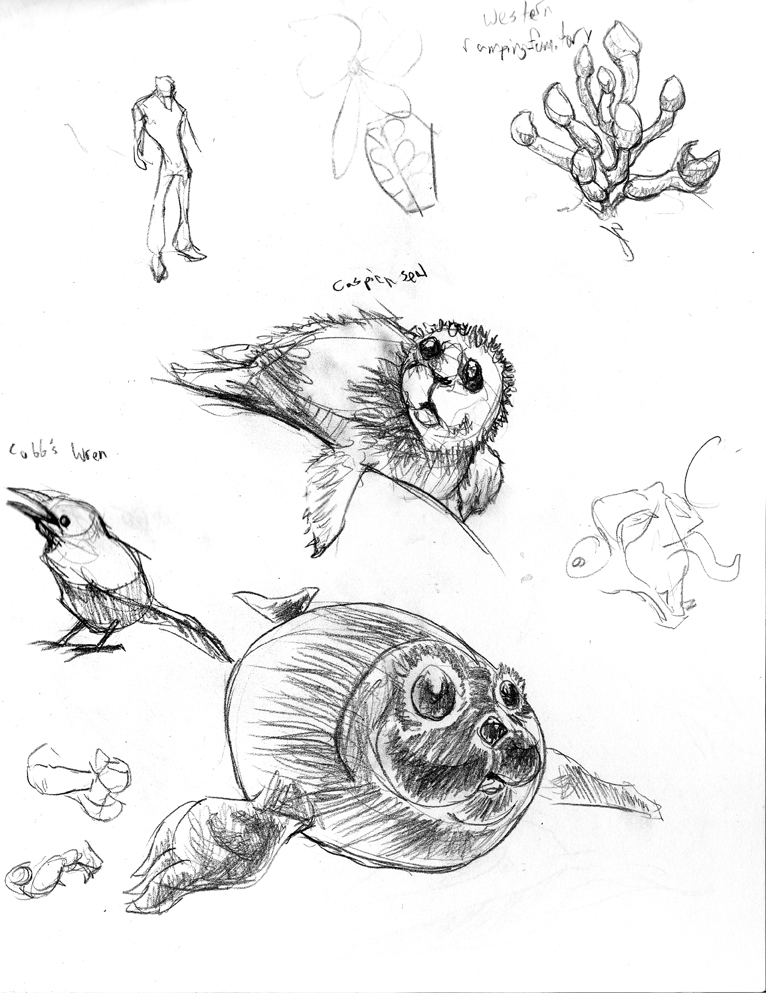
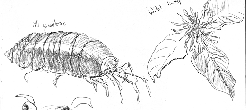
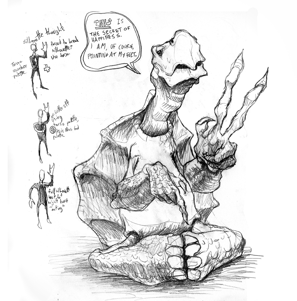
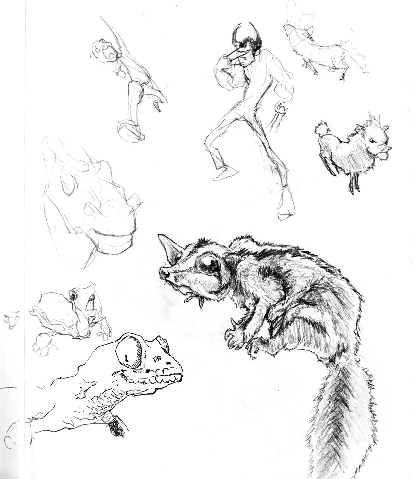
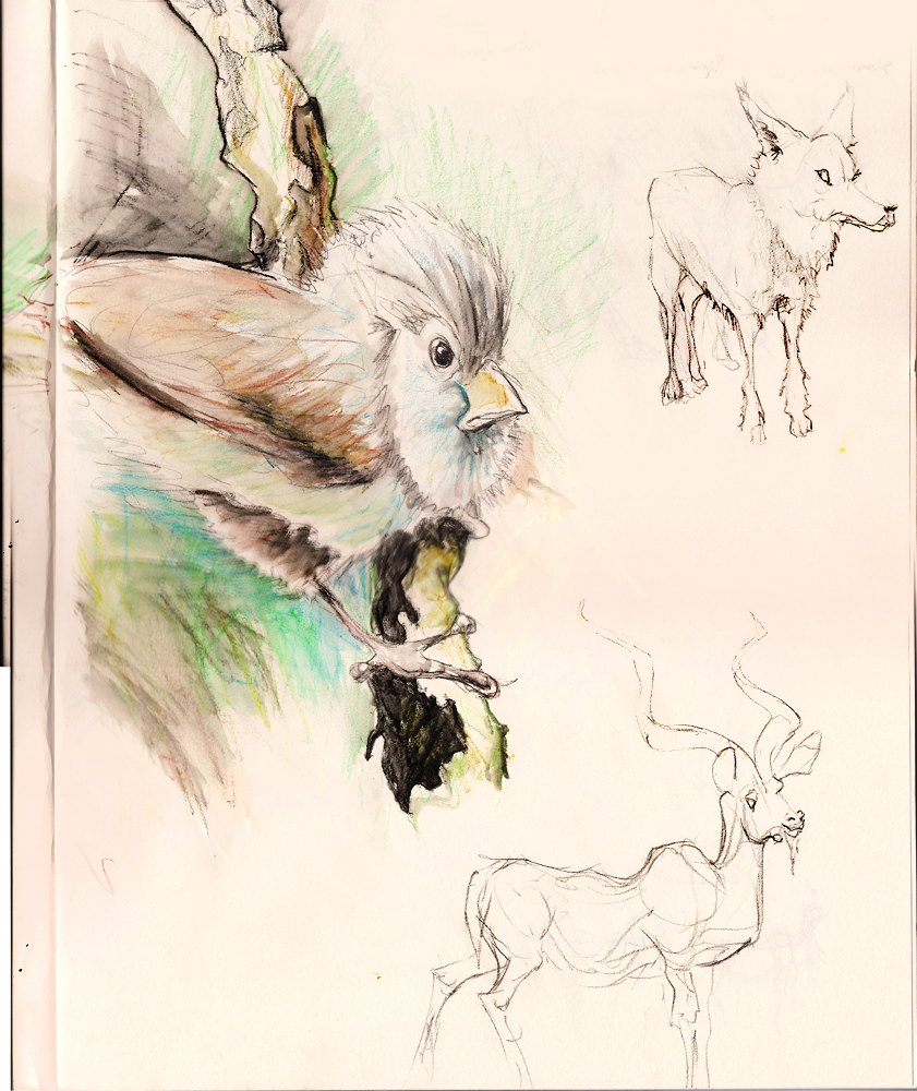
I dunno if it’s “correct”, but I like rendering fur in a specific way. Scribbling back and forth for fur doesn’t look right, because you don’t get wispy points with the fur. Similarly, repeated lines don’t look as good, because it’s hard to get a concise sense of border.
The hybrid is drawing a series of “U” strokes, where the start and end of the U create a wispy, feathery edge for fur and feathes. However, the inner border (the U bend) feels thick and materialized.
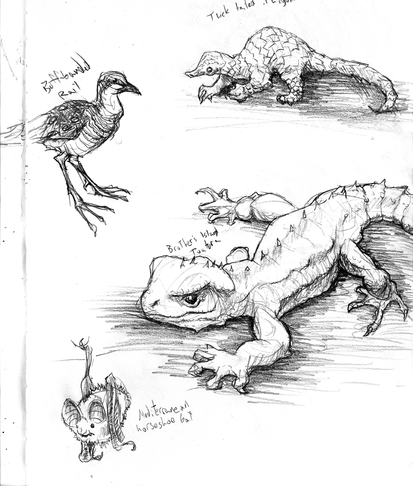
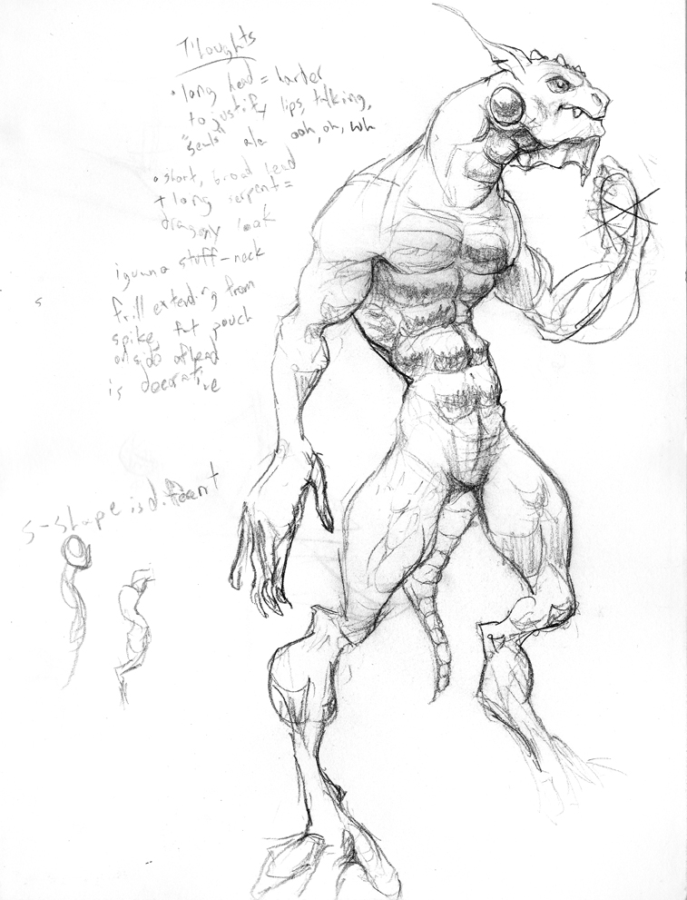
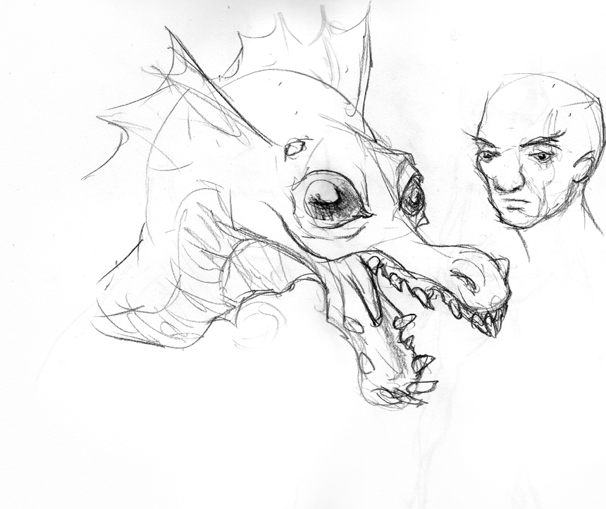
Lizards are one of my favorite things to draw. Their legs don’t fold in a hinge motion. Instead they prop up on their legs and rotate to move them. As a result, their legs bulge with muscle in all the funnest places. Also, their feet (which don’t function like springs ala mammals) have toes that point in slouchy rest poses. If a claw isn’t digging into tree bark, it lays sideways on the nail. It makes them looks a little disheveled and unplanted.
Uploaded in reverse; sketches at the top are the most recent.
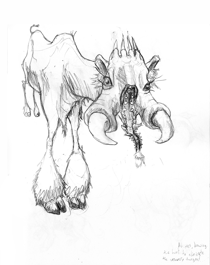
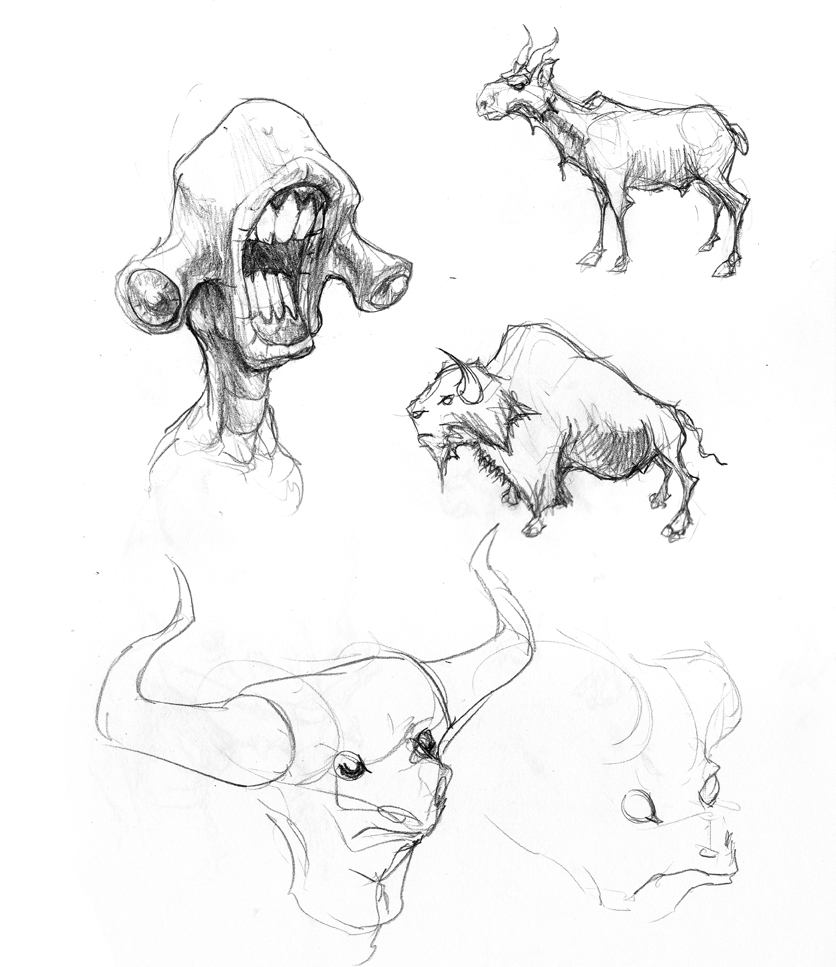
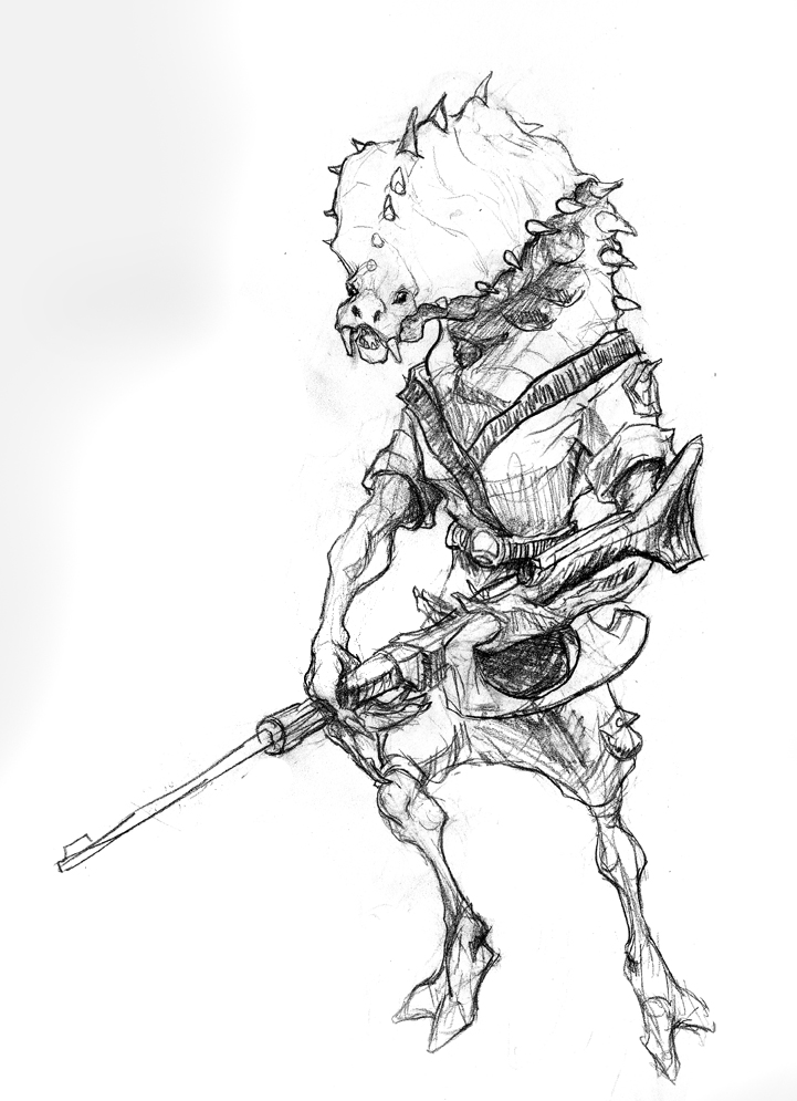
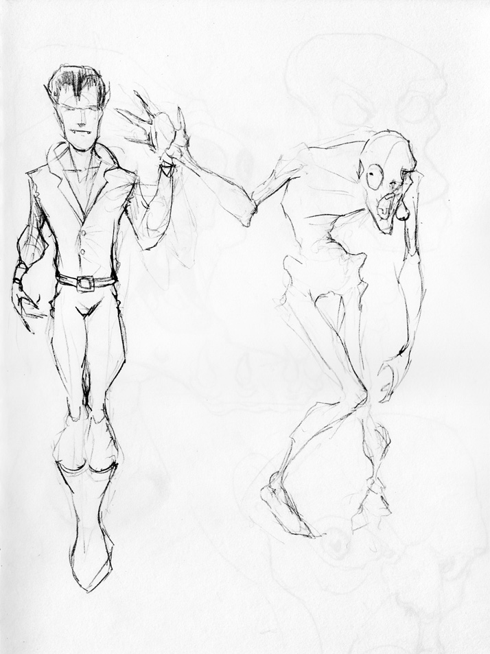
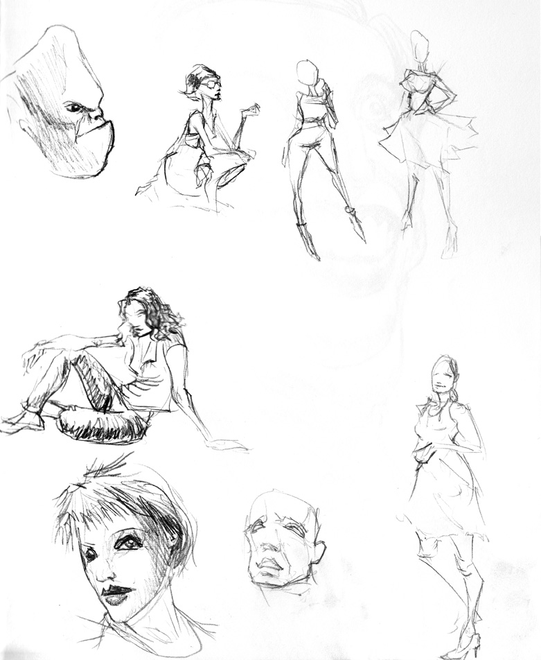
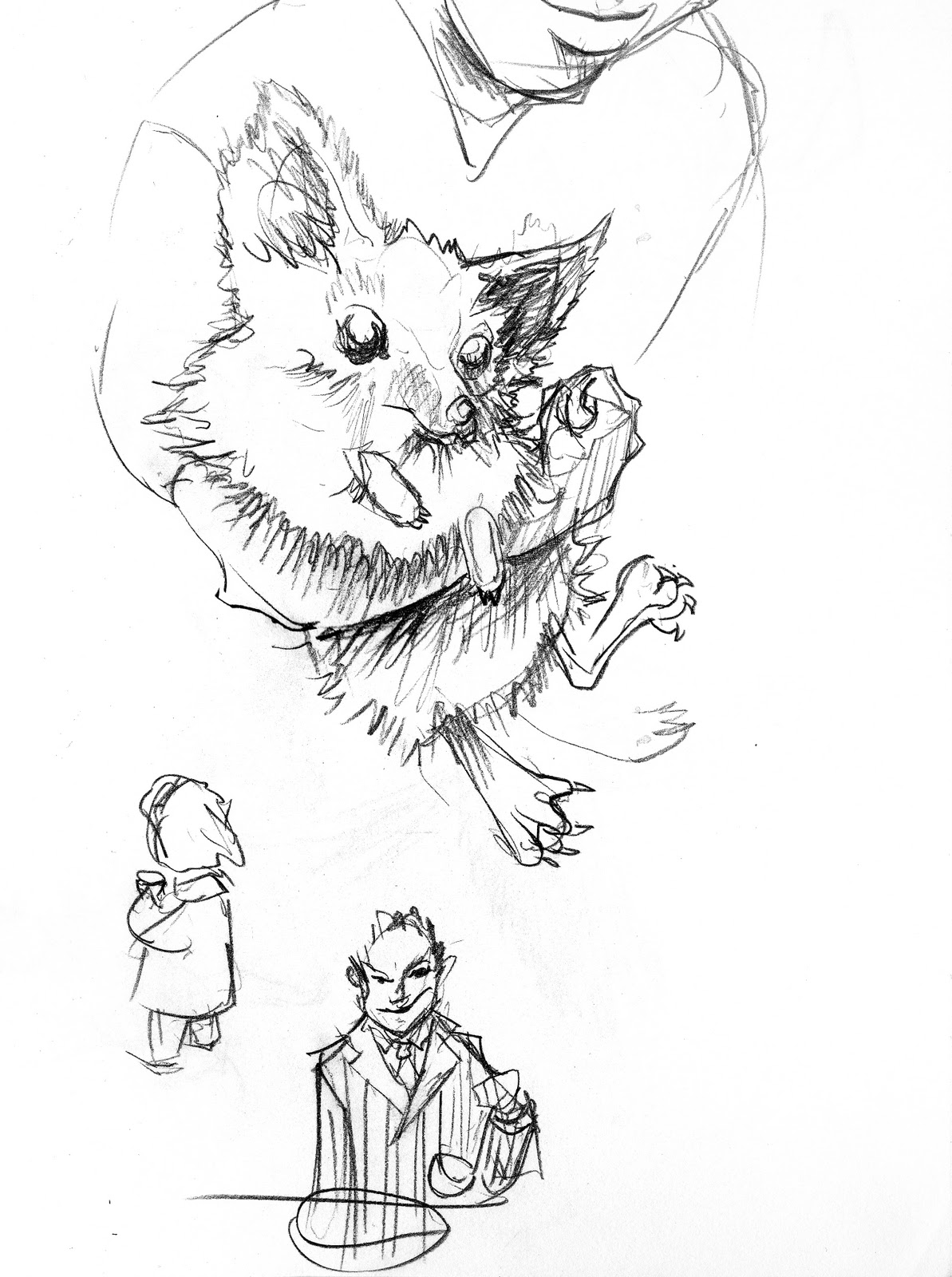
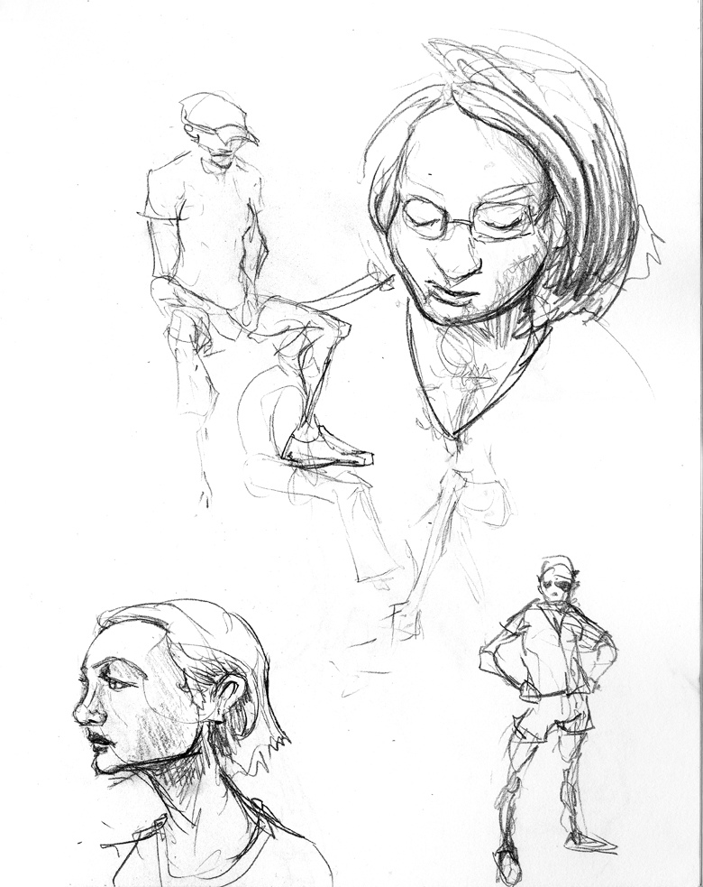
Lots of animals and such. I think I was feeling self-conscious about my habit of heads, so there’s a fair amount more “whole body” anatomical sketches.