I shot these with camera settings of F11 aperture, 1/10 shutter speed, and 400 ISO. For future reference, this came out way too overexposed (only one had the sky crisp) and was the darkest version I took. But according to this badass I need to keep the ISO low to prevent too much grain. And yet, upon saving, closing, and reopening some of these, they look far darker. Here’s their various HDR settings in Photoshop:
01–straight import @32 bits. I didn’t adjust it heavily on import, for fear I’d damage the lighting data.
02–Used the image adjustment HDR toning, set to more saturated. It’s interesting to see what adjustment options are left for 32 bit images, and I’m curious which are good, which are bad. Case in point, Desaturate probably just throws out lots of good juicy pixel info.
03–HDR toning, default settings.
04–Exposure
05–Levels
There’s also a square and equirectangular version, distorted using Flaming Pear‘s Ornament filter and Flexify2 filter.
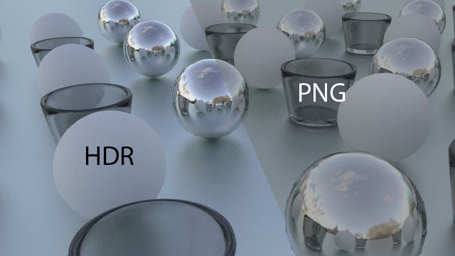
Some quick render results in Cycles, with glass, diffuse and glossy materials at work. I tried this same scene with a version of baechler_park_mirror01 saved as a 16 bit PNG, and you can really tell why HDR matters. The png, even if you get it looking nice, has zero feedback when adjusting the world strength or render exposure, and when the world’s hooked up to node goodies like a brightness/contrast or gamma node, the 32 bit HDR tap dances all over the PNG.
With no environment noding/exposure:
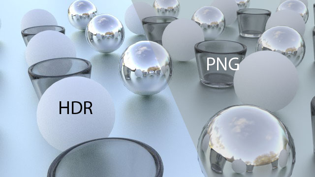
With low exposure (.5)
And noding the environment to have a gamma of 2.
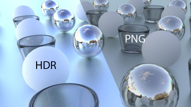
Pretty devastating. Under low exposure, the HDR still keeps the whites white before adjustments. And on the gamma mod, the PNG environment map practically stays the same. Vibrance is lost across the board on these.
All the HDR maps in the .zip file are released under a CC-Zero license. I made these using a homebrew light probe, but that’s another post entirely.